Visual Literacy for Marketing Leaders: How to Brief Creative Without Losing the Concept
The brief was clear in your head. The output is not what you imagined. The gap is not a creative failure - it is a translation failure. Here is how marketing leaders brief creative teams without losing the concept between strategy and execution.
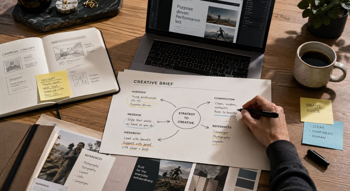
The review meeting. The designer presents the work. The room goes quiet. The marketing director eventually says some version of the same sentence: "It is not quite what I had in mind". The designer asks what specifically is not working. The director cannot articulate it. The conversation ends with vague directions to "make it more premium" or "give it more energy", and the second round comes back further from the original concept than the first.
This is not a creative team problem. It is not a marketing leader problem either. It is a translation problem. The strategic concept lives in one language (narrative, audience, transformation) and the creative output lives in another (composition, hierarchy, contrast, restraint). The brief that was supposed to bridge them was written in neither language. It was written in business adjectives.
Marketing leaders who brief creative teams do not need to become designers. They need to become fluent enough in visual language to brief in it. That fluency is what this article builds, not as an art direction skill, but as a leadership skill. Because the cost of a vague visual brief is not just the rework. It is the strategic concept that dilutes a little more with every revision round, until the published work no longer reflects the thinking that originated it.

Why "Make It Pop" Is the Most Expensive Sentence in Marketing
Every designer has heard it. Every marketing director has said it. "Make it pop" feels like creative direction. It is not. It is the verbal admission that the brief did not contain enough specificity to direct the work in the first place - and the designer, lacking better information, will now invent a direction that may or may not match what the leader actually wants.
The same logic applies to "make it more premium", "make it cleaner", "make it more dynamic", "make it stand out more". These phrases are not creative briefs. They are diagnostic placeholders – the leader has noticed something is wrong, but does not yet have the vocabulary to name what. The designer is then asked to read the leader's mind. The output of mind-reading is rarely strategic.
The translation rule: Every visual adjective in your brief is replaceable by a structural decision a designer can act on. "Premium" becomes "generous white space, restrained typography, neutral palette". "Dynamic" becomes "diagonal composition, high contrast, asymmetric weight". If the adjective cannot be translated, it does not belong in the brief.
In an earlier article, I covered the three principles every marketing leader should understand to read design: Hierarchy, Contrast, and White Space. This article is the operational application: how to use those same principles to direct design, not just evaluate it.
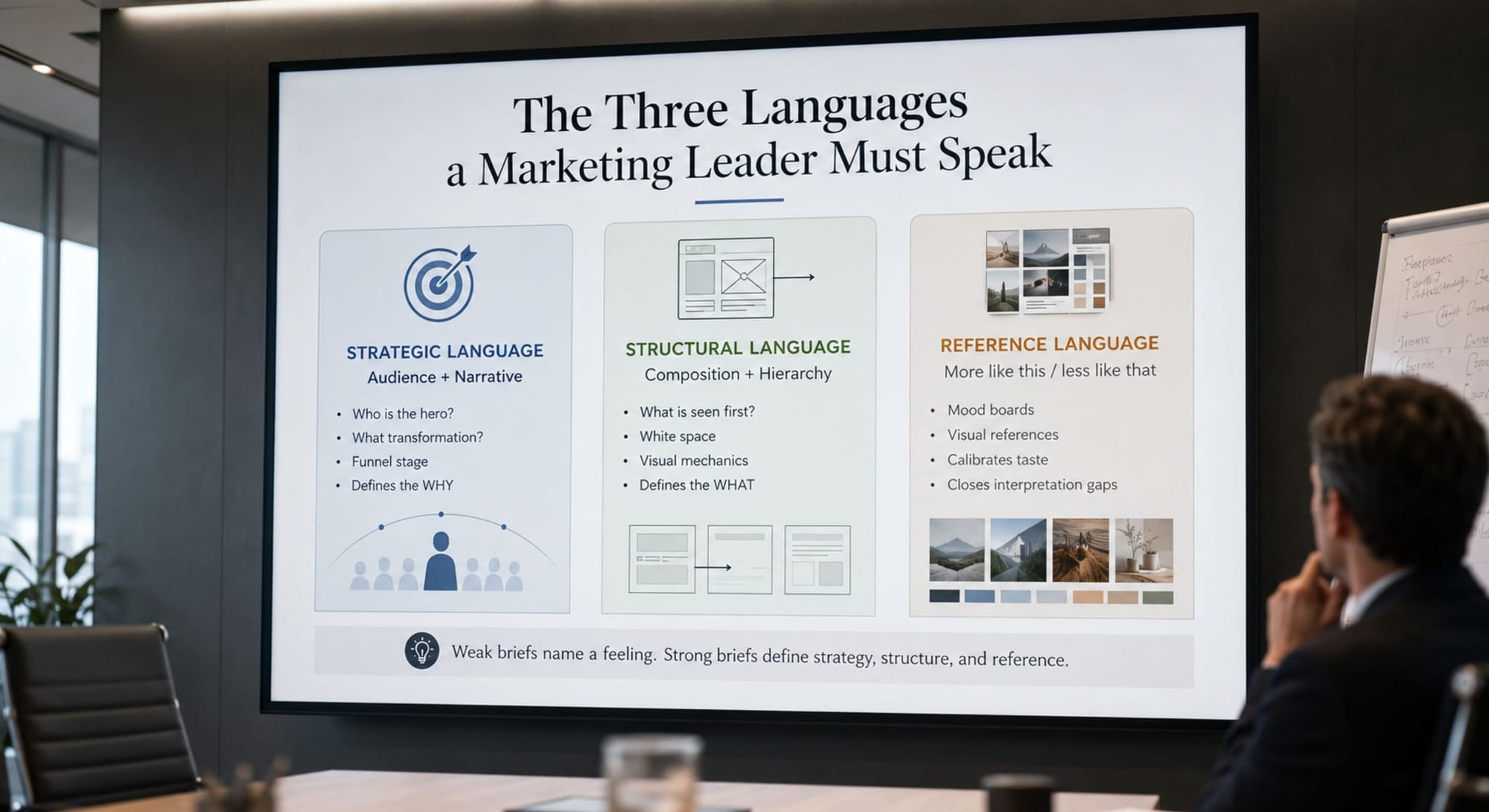
The Three Languages a Marketing Leader Must Speak
Briefing creative work fluently means moving comfortably between three languages, and knowing which one to use at which stage of the brief. Most weak briefs use only the first language and skip the other two entirely. The result is a brief that names a feeling without naming a structure or an outcome.
The Strategic Language. The language of audience and narrative. Who is The Hero? What is their Ordinary World? What transformation does this piece of work move them toward? What stage of the funnel does it serve? This is where every brief begins, and where most briefs stop. It tells the designer the why, but it does not tell them the what.
The Structural Language. The language of composition, hierarchy, and visual mechanics. What is the single most important element on the page or in the frame? What does the eye see first, second, third? Where does the white space sit? What is the dominant axis: vertical, horizontal, diagonal? This is the language designers actually work in. A brief that translates strategy into structural direction respects the designer's craft instead of hoping the designer reverse-engineers it.
The Reference Language. The language of "more like this, less like that": visual references, mood boards, anti-references. References are not a substitute for strategic and structural direction. They are a calibration tool that prevents the same word from being interpreted three different ways. "Premium" means one thing to a luxury automotive designer and another to a B2B SaaS designer. References close that gap before the work begins.
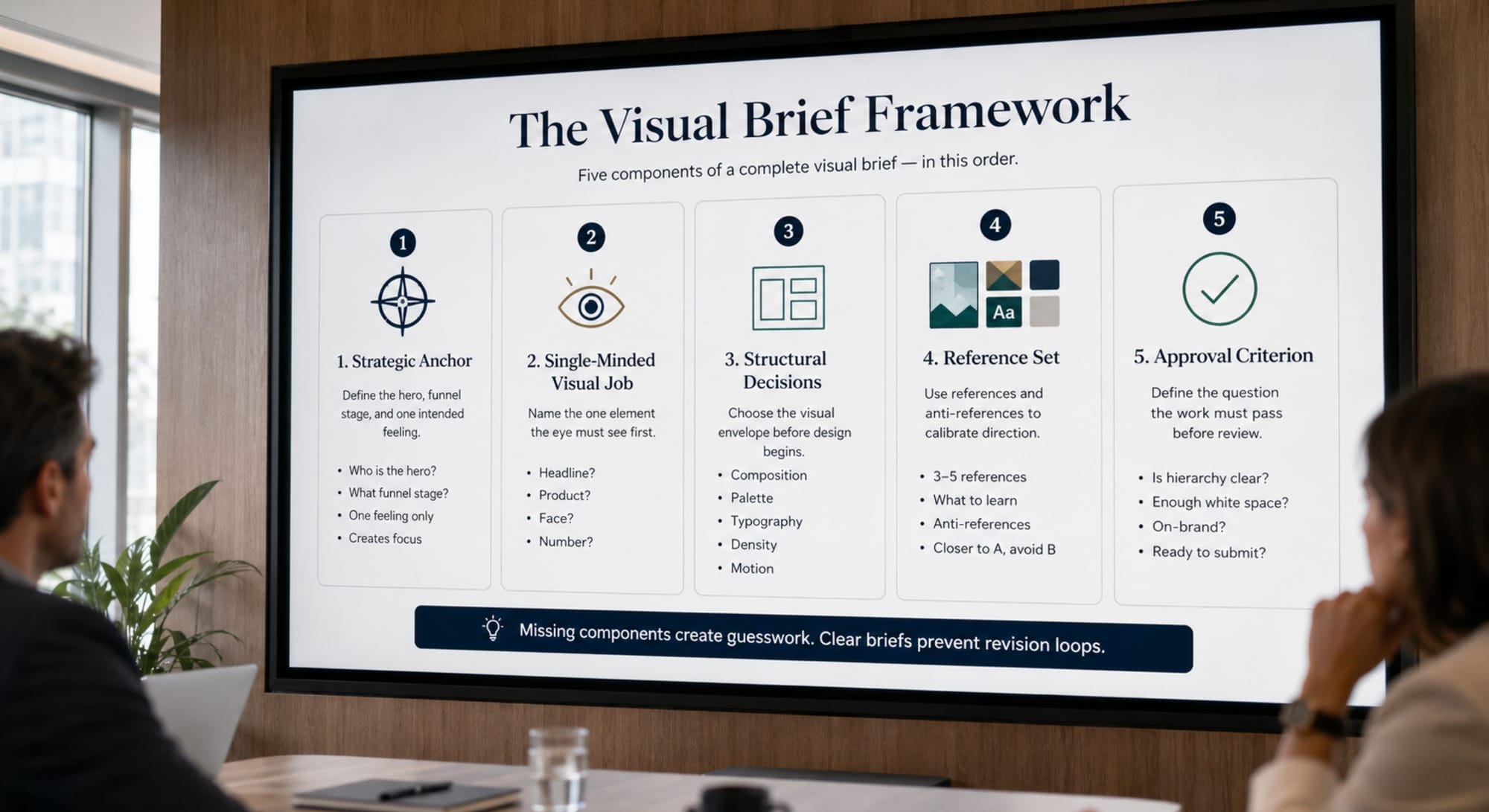
The Visual Brief Framework
A complete visual brief contains five components, in this order. Each one answers a specific question and prevents a specific category of revision. If any component is skipped, the gap it leaves becomes a guess the designer will have to make, and guesses are where concepts get lost.
Component 1 – The Strategic Anchor
One sentence naming The Hero, the funnel stage, and the single feeling this piece of work must produce. Not three feelings. One. A piece that tries to feel "professional and warm and innovative and approachable" feels like none of those things. A piece that tries to feel quietly confident can be designed.
Component 2 – The Single-Minded Visual Job
One sentence answering: what is the single most important thing the eye must see first? The headline? The product? The face? The number? In any composition, only one element can win the hierarchy. Naming it in the brief prevents the designer from spending the entire first round figuring out what you forgot to specify.
Component 3 – The Structural Decisions
Three to five concrete choices made before the design begins. Composition (centred, asymmetric, gridded, freeform). Palette (neutral, saturated, monochrome, brand-led). Typography (display-led, body-led, mixed). Density (generous, balanced, dense). Motion if relevant (still, kinetic, looping). These decisions are not creative constraints - they are the structural envelope inside which the designer's creativity can actually focus.
Component 4 – The Reference Set
Three to five visual references with one sentence each on what specifically to learn from them. Not "this is the vibe" – that is mood-boarding, not directing. Each reference must name the specific element being referenced: the typography on this one, the composition on that one, the colour restraint on the third. Equal weight should be given to anti-references - pieces that look superficially similar but represent the wrong direction. "Closer to A. Avoid the saturation of B".
Component 5 – The Approval Criterion
One sentence naming what the designer should ask themselves before submitting the work. Does the eye land on the headline first? Is there enough white space to feel restrained? Does it look like a piece our brand would publish, not a piece our competitors would? This is the brief writing its own quality check - and it makes the difference between a designer asking "is it ready?" and a designer asking "does it pass the criterion the brief named?". The second question is always more useful.

The Brief Translation: From Vague to Direct
The fastest way to internalise the framework is to see the same brief written both ways.
| ❌ Vague Brief | ✅ Translated Brief |
|---|---|
| "We need a hero image for the new campaign. Make it premium and modern but warm. Should feel innovative. Maybe with some movement. Let's see what you come up with." | Strategic Anchor: Emma - Head of Marketing - must feel quietly confident this brand understands her world. Visual Job: The eye lands on the headline first. The product is implied, not shown. Structural Decisions: Asymmetric composition. Neutral palette with one warm accent. Display-led typography. Generous white space - at least 40% of the frame. References: Closer to the Apple landing page restraint and the Aesop product photography light. Avoid the saturation of typical SaaS hero imagery. Approval Criterion: Does the headline win the hierarchy without competing with the imagery? |
Both briefs ask for the same piece of work. Only one of them can be executed without three rounds of revisions and a slow drift away from the strategic concept. The translated brief is not longer because it is more bureaucratic. It is longer because it is more specific, and specificity is the only honest currency between marketing and creative.
Three Briefing Mistakes That Quietly Dilute Concepts
Mistake #1: Writing the brief in business adjectives instead of structural decisions
Premium, modern, dynamic, fresh, bold, clean, innovative, sophisticated, edgy, accessible. Every one of these words is a placeholder for a structural decision the brief did not make. The designer translates the placeholder, and every translation is a guess. Three guesses produce a piece of work the marketing leader recognises as "off" without being able to say why. The fix is to translate every business adjective into a structural decision before the brief is sent.
Mistake #2: Sending references without anti-references
References tell the designer what direction to head toward. Anti-references tell the designer what looks similar but is the wrong direction, and that distinction is often more useful. Two pieces of work can both look "minimalist" and lead to entirely different outputs. Naming the one to avoid prevents the designer from accidentally landing on the version you do not want. References without anti-references is half a calibration.
Mistake #3: Approving on personal taste instead of the strategic criterion
The most expensive moment in any creative review is when the marketing leader's personal aesthetic preference overrides the strategic criterion the brief itself defined. The designer delivers work that meets the brief. The leader does not personally like one element. The work goes back. The next round, the designer adjusts based on personal taste rather than strategic intent, and the strategic concept dilutes a little further. The fix is to evaluate every piece of work against the Approval Criterion in the brief, not against the leader's personal preference. If the criterion was wrong, change the criterion. Do not change the work.
How to Use GenAI as Your Brief Translator
Translating a vague brief into a structurally specific one is exactly the kind of structured reasoning task GenAI can accelerate. Not by inventing the strategic decisions - those still come from you, but by surfacing the structural decisions implicit in the strategy and rendering them in language a designer can act on.
You are a Senior Art Director with 15 years of experience translating marketing briefs into visual direction for design teams.
I will share a draft creative brief.
Your task is to translate it into a Visual Brief using this five-part structure:
1. Strategic Anchor (one sentence: Hero, funnel stage, single feeling)
2. Single-Minded Visual Job (one sentence: what the eye must see first)
3. Structural Decisions (3-5 concrete choices: composition, palette, typography, density, motion)
4. Reference Set (suggest 3 references and 2 anti-references – describe what to learn from each, do not just name brands)
5. Approval Criterion (one sentence: what the designer asks before submitting)
Draft brief: [Paste your current brief here]
Rules:
- Every business adjective in the draft must be translated into a structural decision. Flag any adjective you cannot translate without more strategic input.
- The Single-Minded Visual Job must name ONE element that wins the hierarchy. If the draft implies multiple, force a choice.
- References and anti-references must include WHAT to learn – never just brand names.
- If the strategic input is too thin to write a useful brief, name the specific gap rather than guessing.
Validate the result. Use your knowledge of the brand, the channel, the audience, and the design team's actual capability. GenAI translates the structure of the brief – it does not know which references your designers will recognise, which structural decisions are achievable in your timeline, or which palette your Brand Guardian will approve. You bring that judgment. GenAI brings the translation discipline.
Final Thought
The strategic concept that lives in our heads will only ever reach the audience through the work the creative team produces. Every word missing from the brief is a decision the designer makes on your behalf. Sometimes that decision is brilliant. Often it is reasonable but slightly off. Occasionally it is exactly wrong, and the only way to know which is which is to make those decisions yourself, in the brief, before the work begins.
Visual literacy is not about becoming a designer. It is about respecting the craft enough to direct it in its own language, and protecting the strategic concept long enough for it to reach the page intact.
When your last campaign came back not quite right, was the design wrong, or was the brief silent on the question the designer had to answer alone?