Copywriting: The Substance, Building Content That Retains
Learn how to structure long-form content that keeps readers engaged, using narrative flow, F-pattern readability, and GenAI audits to improve retention.

Every day, we click a great headline only to find a wall of text that feels like a chore to read. The hook worked - the reader clicked, opened, scrolled. And then they left.
This is the second great failure of content marketing. The first is not getting clicked. The second – and arguably more damaging – is getting clicked and then losing the reader in the first paragraph. Because when we fail to structure our long-form content, whether it's a blog, a landing page, or a deep-dive LinkedIn post, we aren't just losing a reader. We are losing the trust we just started to build with the hook. In this article, I'll show you the structural framework I use to turn information into an experience - and how to use GenAI to audit your drafts for readability before a single reader sees them.
The Hook Got the Click. Now What?
In the previous article in this series, we covered the hook – the Inciting Incident that earns the first 2 seconds of attention. But attention is not engagement. A reader who clicks is a prospect. A reader who finishes is a convert.
The distance between those two states is structure.
In 2026, SEO is no longer about repeating keywords. It's about Search Intent and Narrative Satisfaction - did the content actually answer what the reader came for, and did it do so in a way that kept them reading long enough to get there? Google's ranking signals increasingly reward dwell time, scroll depth, and return visits - all of which are outputs of good structure, not keyword density.
Structure is the skeleton of your story. Without it, your message is just a heap of ideas that can't stand on its own.
To keep the Hero (our customer) engaged, we must move from simply "providing information" to "architecting an experience."
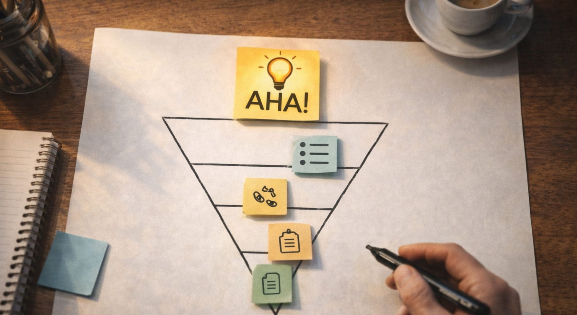
The Inverted Narrative Pyramid
Traditional journalism taught writers to put the most important information first - the "inverted pyramid." Narrative marketing takes this further: we structure content so the most valuable "Aha!" moments appear early, followed by the supporting details that deepen understanding. The reader gets the win quickly - and keeps reading to understand how to replicate it.
The Lead (The Promise)
Immediately validate the hook. Tell the reader exactly what they will gain - and in how long. "In the next 5 minutes, you'll have a framework for structuring any long-form content". The reader now knows the investment is worth it before they've made it.
The Bridge (The Context)
Connect their current pain to the solution you're about to provide. Don't jump from hook to content; give the reader a moment to understand why this matters to their specific situation. This is the transition from "I'm interested" to "this is for me".
The Core (The Substance)
This is where you deliver the "magic tool" – the framework, the how-to, the data, the insight. Break it down into scannable, high-value sections. Each section should feel like a micro-win. The reader should think "I didn't know that" or "I knew this but never had words for it" at least once per section.
The Wrap (The Action)
Summarize the transformation, not the content. Not "we covered X, Y, Z" but "you now have X, which means you can do Y". Then provide one clear next step: a CTA, a related article, a tool to try. Close the loop you opened in the hook.
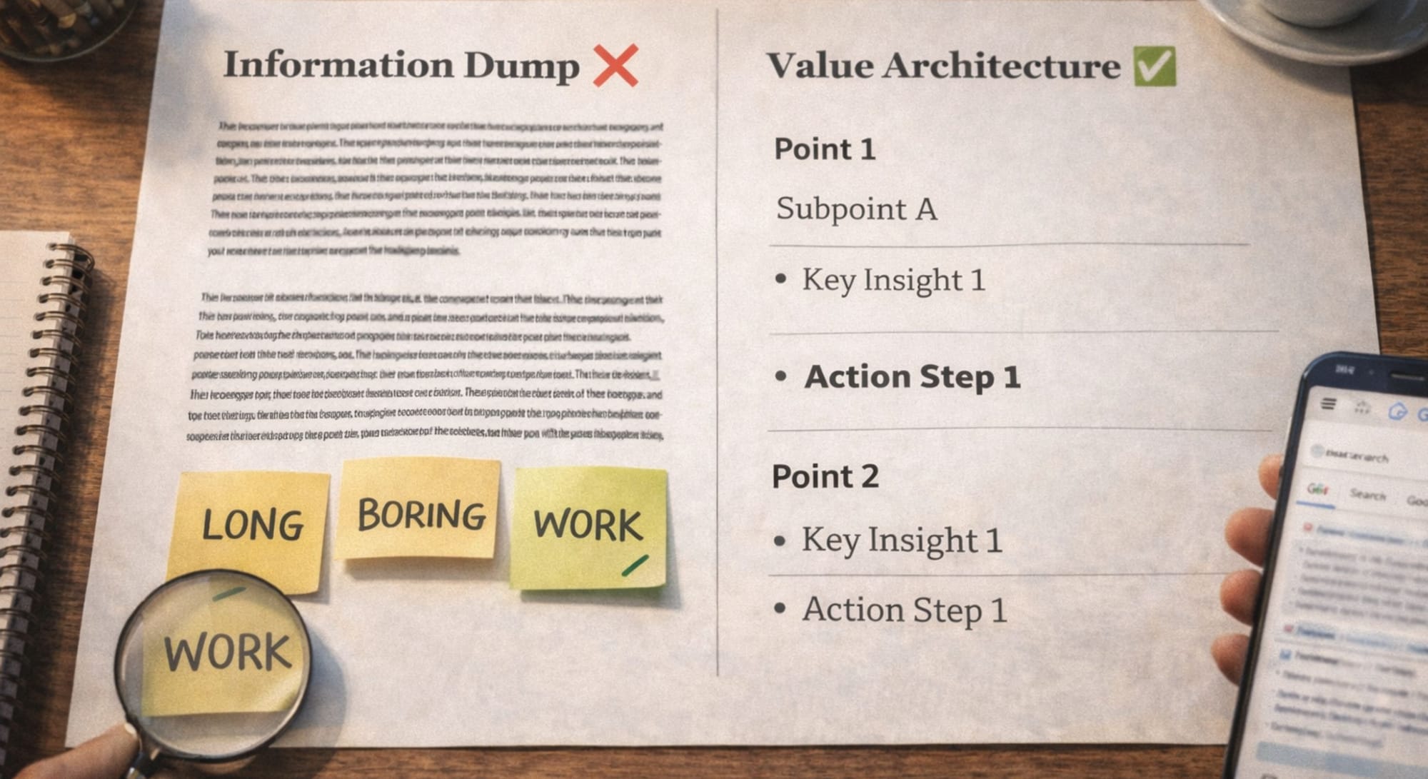
Information Dump vs. Value Architecture
The biggest retention killer in long-form content isn't bad ideas. It's the way those ideas are presented. There are two fundamentally different approaches to structuring content, and the difference between them is immediately visible to the reader's eye, before they've read a single sentence.
Information Dump  | Value Architecture  |
|---|---|
| Structure: Long, dense paragraphs with no visual hierarchy | Structure: Bullet points, bold headers, white space, and visual breaks |
| Readability: Academic and detached, feels like a report | Readability: Conversational and "breathable", feels like a guide |
| SEO Focus: Keyword density, stuffing terms the algorithm might reward | SEO Focus: Intent satisfaction and semantic relevance, answering what the reader actually needs |
| Reader behavior: Abandonment within 30 seconds, the brain flags it as "work" | Reader behavior: High dwell time, scroll depth, and "Save" rate, the brain processes it as "value" |
Treat white space as a tool for emphasis. If everything is bold, nothing is. If every sentence is its own paragraph, the rhythm is lost. Aim for a "staccato" flow: short sentences for impact, longer ones for explanation.
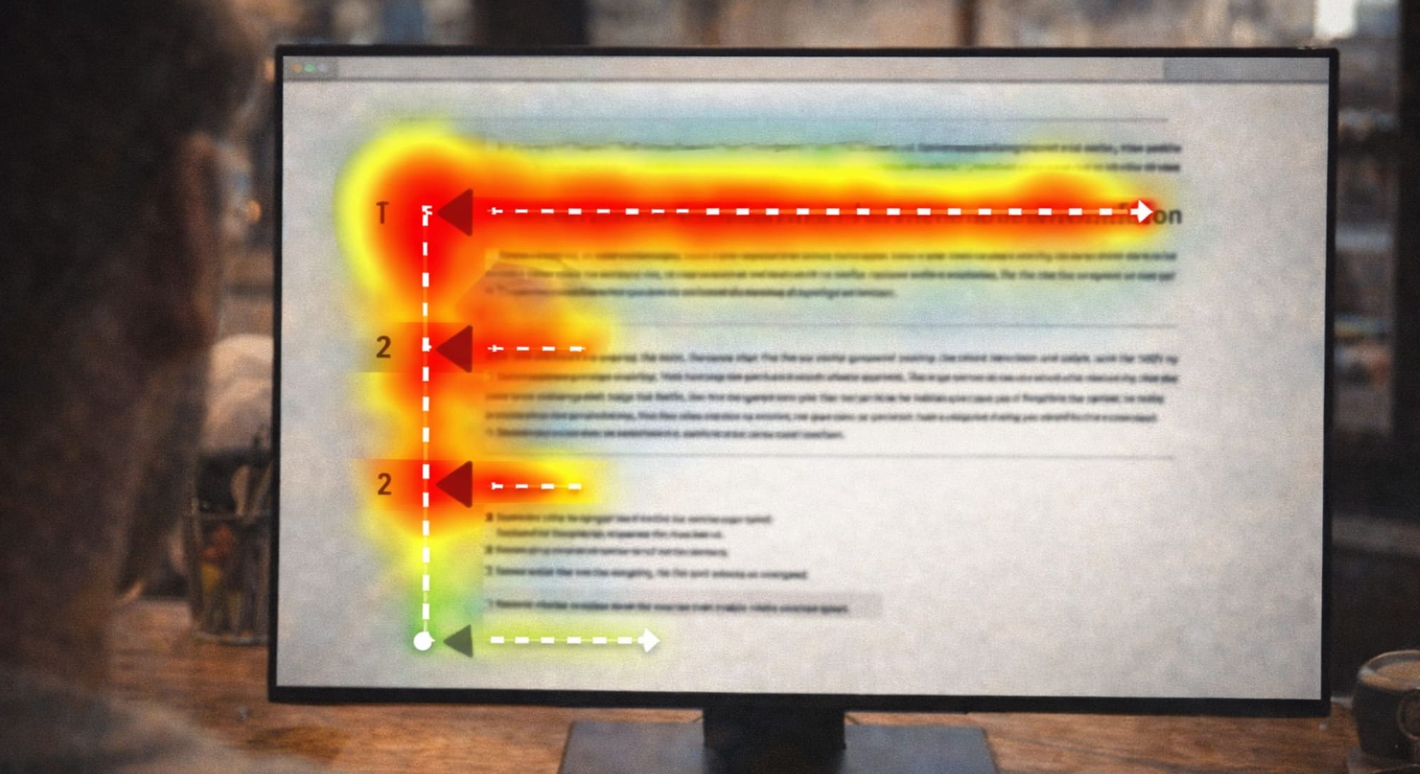
Designing for the F-Pattern: How People Actually Read Online
Eye-tracking research consistently shows that online readers don't read linearly - they scan in an F-Pattern. They read across the top (the headline and first sentence), then scan down the left side looking for signals – headers, bold text, the first word of each bullet point. Only when something catches their eye do they read horizontally again.
This isn't laziness. It's efficiency. Your reader is pre-qualifying your content before they invest full attention. Your job is to make that scan rewarding enough to trigger a full read.
Design for the F-Pattern with three tools:
Micro-Headings That Tell the Story
Write headers that deliver value on their own - not labels, but mini-headlines. If a reader skims only your headers, they should capture 70% of the article's value. "The Framework" is a label. "The 4-Step Framework That Cuts Revision Rounds by Half" is a micro-headline.
The Power of Three
Group ideas in threes wherever possible. Three is the smallest number the human brain recognizes as a pattern and the largest it holds in working memory without effort. Two feels incomplete. Four starts to feel like a list. Three feels like a system. This is why so many frameworks in this series use three components; it's not arbitrary, it's cognitive design.
Visual Breaks as Micro-Rests
Use horizontal rules, blockquotes, call-out boxes, and white space to separate distinct ideas. Each visual break gives the reader's brain a moment to process what came before and prepare for what comes next. In long-form content, these breaks are the difference between a reader who finishes and a reader who bounces at paragraph six.
The Rhythm Problem: Why Some Content Feels Exhausting
Beyond structure and visual hierarchy, there is a subtler quality that separates content that feels effortless to read from content that feels like work: sentence rhythm.
Read these two versions of the same idea:
Monotone rhythm:
"Content structure is important. It helps readers navigate. It also improves SEO. Good structure increases dwell time. It reduces bounce rates. It also improves conversion."
Varied rhythm:
"Content structure is invisible when it works. The reader doesn't notice it, they just notice that they're still reading 800 words in, absorbed without effort. That's not an accident. It's the result of alternating short punchy sentences with longer, more explanatory ones, creating a cadence that keeps the brain engaged."
The first version is correct. The second is readable. The difference is rhythm - the deliberate variation between sentence length and complexity that creates forward momentum in prose.
A practical rule: never write three sentences of the same length in a row. Short. Short. Short becomes monotonous. Long followed by long followed by long becomes exhausting. Alternate deliberately.
Content Retention Mistakes to Fix Before Publishing
Mistake #1: Burying the value
The most common structure mistake is saving the best insight for the end, as if the reader needs to "earn" it. On the internet, readers don't earn anything. They scan, decide in 3 seconds, and either stay or leave. Lead with your strongest insight and let the rest of the article deepen it.
Mistake #2: One idea per sentence, one sentence per paragraph
Fragmented writing that places every sentence on its own line creates a visual rhythm on LinkedIn; but on a blog, it reads as hollow. A paragraph should develop a single idea, not list 4 isolated fragments. Save fragmentation for emphasis, not as a default structure.
Mistake #3: Transitions that summarize instead of propel
"So, as we've established above..." "In conclusion..." "As mentioned earlier..." These transitions pull the reader backward instead of forward. Every transition should move the reader one step closer to the resolution, not recap what they've already read.
Mistake #4: A CTA that asks too much
The Wrap (Step 4 of the Pyramid) should close with one action, not a paragraph of options. "Subscribe to my newsletter, follow my page, share this post, book a call, download the template". That's five asks. The reader does none of them. Choose the single most valuable next step for this specific piece of content and ask for that alone.
Mistake #5: Ignoring mobile formatting
More than 60% of content is read on mobile in 2026. A paragraph that looks elegant on desktop becomes a wall of text on a phone screen. Keep paragraphs to 3 sentences maximum for mobile-first content. Use line breaks generously. Test your content on your own phone before publishing.
How to Use GenAI as Your Structure Architect
Once you have a draft, GenAI can audit it for "readability friction" - the structural and rhythmic issues that cause readers to disengage - before it reaches a single real reader.
Use this prompt:
You are a Senior Editor and SEO Strategist specializing in long-form content for 2026 search algorithms and mobile readers.
I have a draft article I'd like you to audit before publishing.
Task:
1. Identify any "fluff" paragraphs - sections that can be removed without losing value. For each, explain why it's fluff.
2. Identify any sections where the value is buried - where the key insight appears too late in the paragraph or section.
3. Suggest 3 Micro-Headings that follow the Hero's Journey arc (Problem → Guidance → Transformation).
4. Rewrite the intro paragraph to satisfy Search Intent within the first 2 sentences.
5. Audit the rhythm - flag any sequences of 3+ sentences with the same structure or length.
6. Check the Wrap (final section) - does it close the loop opened in the hook? Does it have a single, clear CTA?
Draft: [Insert your draft here]
Output format: Provide your findings in numbered sections, with specific quotes from the draft and suggested rewrites where relevant.
Run this audit on every long-form piece before publishing. The 20 minutes it takes will save you from launching content that technically exists but doesn't perform.
Substance Is Not Volume, It's Retention
The instinct when writing long-form content is to add more: more sections, more data, more examples, more caveats. But substance isn't measured in word count. It's measured in how much the reader retains – and acts on – after they close the tab.
A 600-word article with a clear structure, a memorable framework, and a single actionable takeaway retains more than a 2,000-word information dump that covers everything and teaches nothing. Every sentence you write should pass one test: does this move the reader one step closer to the transformation I promised in the hook?
If it doesn't, cut it.
Final Thought
Substance isn't about how much we say; it's about how much they retain. When we provide a clear, structured path, we aren't just "content creators" – we are Guides leading our Hero to a win.
Are we building a wall of text, or a staircase to a solution?
Recommended Use Cases: