The Decision-Support Dashboard: What to Measure and How to Present It
Most marketing dashboards display data. Very few support a decision. The difference is not the metrics; it is the design. Here is how to build a dashboard a board can actually decide from, and present it so the numbers tell a story instead of demanding one be invented on the spot.

Picture the quarterly review. The marketing director shares a dashboard on the screen. It is thorough: dozens of numbers, several charts, a respectable amount of green. The board looks at it politely. Someone asks a question the dashboard does not answer. The director talks around it. Someone else asks whether a particular number is good or bad, and the honest answer is "it depends". The meeting ends with the board no more able to make a decision than when it began, and a vague, shared sense that marketing is busy, which is not the same as marketing being effective.
The dashboard was not wrong. It was built for the wrong job. It was built to display data – to prove that measurement is happening – when its actual job in that room was to support a decision. Those are two different artefacts. One answers "what are all the numbers?". The other answers "what should we do, and what does the evidence say about it?". Most marketing dashboards are the first kind presented in a room that needed the second.
The previous article on the blog established which metrics matter for your business model. This one is about the communication layer on top of that: how to design and present those metrics so they support the decision the room is actually there to make. Choosing the right metrics is necessary. Presenting them so a board can act is what turns measurement into influence.
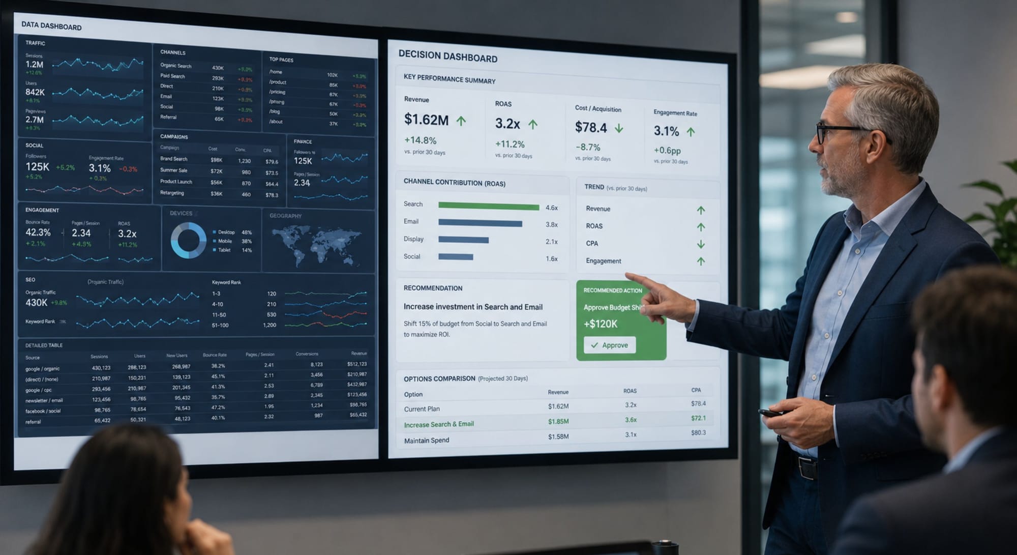
The Difference Between a Data Dashboard and a Decision Dashboard
A data dashboard is organised around availability: it shows what can be measured, grouped by where the data lives. Traffic sits with the other web metrics. Spend sits with the other finance metrics. Engagement sits with the other social metrics. The organising logic is the source of the data, and the implicit question is "is everything being tracked?". It is a completeness artefact. Its highest virtue is that nothing is missing.
A decision dashboard is organised around a question. It starts not from the data, but from the decision the audience needs to make – approve the budget, change the channel mix, hold the course, intervene – and presents only the evidence that bears on that decision, arranged so the answer is legible. The organising logic is the decision, not the data source. Its highest virtue is not completeness. It is clarity about what to do.
The decision-support principle: A dashboard's job in a leadership room is not to prove that measurement is happening. It is to make a decision easier to reach and easier to defend. If the audience leaves the meeting knowing more numbers, but no more able to decide, the dashboard displayed data; it did not support a decision. Build for the decision, not for the completeness.

The Three-Tier Dashboard Structure
A decision-support dashboard is built in three tiers, each serving a different depth of attention. The tiers are not three separate dashboards; they are three layers of the same one, arranged so the most important information is legible in five seconds and the supporting detail is available for the questions that follow.
One Number – One Verdict
For the five-second read
The top tier answers the only question the room truly starts with, namely "Is this working or not?". It carries the single primary metric for the business model – chosen using the previous article's lens – with a clear verdict attached. Not just the number, but what it means: on track, ahead, or behind, against a target set in advance.
If the board reads nothing else, the headline tier must leave them knowing whether marketing is winning. One number. One direction. One verdict. Everything below exists to explain it.
Contains: The primary metric · Its trend against target · A one-line verdict in plain language – "ahead of plan", "slipping, and here is why below".
The Diagnostic – Why the Headline Moved
For the follow-up question
The middle tier answers the question the headline provokes, namely "Why?". It carries the stage-level diagnostic metrics that explain the movement in the primary number – the funnel stages, the channel contributions, the leading indicators.
This tier is where the board's first real question gets answered before it is asked – which is what makes a marketing director look in command of the numbers rather than cornered by them. When the headline slips, this tier shows where. When it climbs, this tier shows what to protect.
Contains: 3-5 diagnostic metrics tied to the primary · The stage or channel where the movement originated · Leading indicators for the next period
The Evidence – Depth on Demand
For the challenge
The bottom tier is the supporting detail: the granular data, the segment breakdowns, the methodology. It is not presented by default. It is held in reserve, available for the moment a board member challenges a number or wants to go deeper.
The evidence tier is what lets a director answer a hard question with a specific figure instead of a promise to follow up. It exists to be consulted, not displayed, and keeping it out of the main view is what keeps the main view decision-legible.
Contains: Granular breakdowns · Segment and cohort detail · Methodology and definitions · The raw figures behind every headline and diagnostic number
The inversion that matters: Most dashboards present the evidence tier first – the granular data – and expect the audience to synthesise the headline themselves, in real time, in the meeting. The decision dashboard inverts this. It does the synthesis in advance and presents the verdict first, holding the evidence for when it is asked for. The synthesis is the marketing director's job, not the board's. A dashboard that outsources the synthesis to the room has outsourced the director's most valuable contribution.
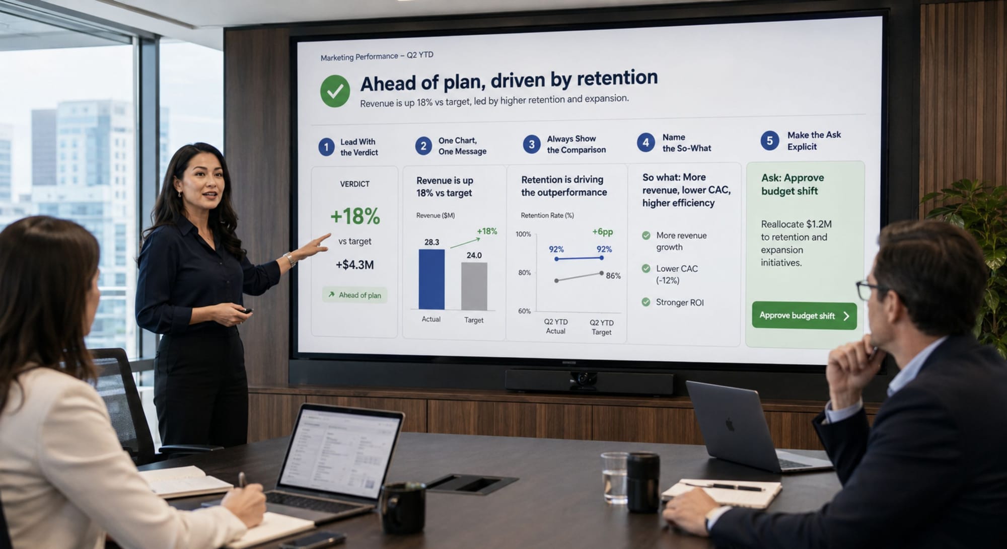
The Five Principles of Data Storytelling
Structure gets the dashboard built. Storytelling gets it understood. The same three tiers can be presented in a way that drives a decision or in a way that buries it, and the difference is five principles that turn a set of numbers into a narrative a room can follow.
Principle 1 – Lead With the Verdict
State the conclusion first, then support it. "We are ahead of plan, driven by retention"; then the numbers. Never make the room wait through the data to learn what it means.
Principle 2 – One Chart, One Message
Every chart makes exactly one point, and its title states that point in words. If a chart needs a paragraph of explanation, it is carrying too many messages – split it.
Principle 3 – Always Show the Comparison
A number alone means nothing. A number against a target, a prior period, or a benchmark means something. Never present a figure the room cannot judge as good or bad.
Principle 4 – Name the So-What
Every metric that earns a place must answer "so what should we do?". If a number changes nothing about any decision, it belongs in the evidence tier, not the headline.
Principle 5 – Make the Ask Explicit
A decision dashboard ends in a request: approve, continue, intervene, reallocate. If the presentation ends with "any questions?" instead of a specific ask, it was a report, not a decision aid.
These principles are not cosmetic. They are the difference between a marketing director who presents numbers and a marketing director who leads with them. The board does not remember the dashboard. It remembers whether the person presenting it seemed in command of the story the numbers told, and whether the decision it was asked to make felt clear or murky. Data storytelling is how a competent measurement system becomes organisational influence.
Three Mistakes That Turn a Dashboard Into Wallpaper
Mistake #1: Presenting completeness instead of a conclusion
The instinct in a high-stakes room is to show everything – every metric tracked, every chart built – as proof of thoroughness. The effect is the opposite of the intent. A board faced with forty numbers and no verdict concludes that marketing cannot tell what matters from what does not, which is precisely the judgment a marketing director cannot afford. Completeness reads as rigour to the person who built the dashboard and as noise to the person trying to decide from it. Lead with the conclusion. Hold the completeness in the evidence tier for when it is asked for.
Mistake #2: Presenting numbers without comparisons
A dashboard that shows "conversion rate: 3.2%" has told the room nothing it can act on, because 3.2% is neither good nor bad in isolation. Against a 2.8% target it is a success story. Against a 4.1% prior quarter it is a problem. The number without the comparison forces every board member to privately guess whether to be pleased or concerned, and a room full of people guessing in different directions is a room that cannot reach a shared decision. Every number in a decision dashboard must arrive with the comparison that makes it judgeable.
Mistake #3: Ending in questions instead of an ask
The most common way a strong dashboard fails to produce a decision is that the presentation ends passively: "happy to take any questions". This hands the initiative to the room and turns a decision aid back into a report. A decision-support dashboard is built to end in a specific ask: approve the reallocation, extend the budget, hold the current course through next quarter. The ask is what converts the measurement into a decision. Without it, the board admires the numbers, thanks the director, and decides nothing, which means the whole exercise measured a great deal and changed nothing.
How to Use GenAI as Your Dashboard Editor
Turning a data dashboard into a decision dashboard is a restructuring task, and GenAI is genuinely useful as an editor that pressure-tests the structure and the story before the board sees it. Not to generate the numbers, but to challenge whether they are arranged to support a decision.
Use this prompt:
I will share the contents of a marketing dashboard I am preparing to present. Restructure it into a three-tier decision-support format and pressure-test the story.
THE DECISION THIS DASHBOARD MUST SUPPORT:
[State the actual decision the room needs to make, e.g. "approve next quarter's budget", "decide whether to shift spend from paid to content"]
THE BUSINESS MODEL AND PRIMARY METRIC:
[From the previous article's lens, e.g. subscription, primary metric is net revenue retention]
THE CURRENT DASHBOARD CONTENTS:
[List every metric and chart currently included]
RESTRUCTURE AND PRESSURE-TEST:
1. HEADLINE TIER: Identify the single primary metric and the one-line verdict it should carry. If the current dashboard buries this, say so.
2. DIAGNOSTIC TIER: Select the 3-5 metrics that explain movement in the primary. Flag any current metric that is neither the headline nor a genuine diagnostic.
3. EVIDENCE TIER: List which current metrics should be demoted to supporting detail, present on demand, not by default.
4. THE COMPARISON CHECK: Flag every metric currently shown without a target, prior period, or benchmark. A number without a comparison cannot be judged.
5. THE SO-WHAT CHECK: For each metric in the headline and diagnostic tiers, state the decision it informs. If a metric informs no decision, recommend demoting it.
6. THE ASK: Based on the decision this dashboard supports, draft the explicit ask the presentation should end with.
Rules:
- Organise around the decision, not the data source.
- Ruthlessly demote completeness metrics to the evidence tier. The headline must be legible in five seconds.
- If the dashboard cannot support the stated decision even after restructuring, say what is missing.
Validate the restructure against the room you are actually presenting to. GenAI arranges the tiers and pressure-tests the story logic, but it does not know your board's specific concerns, the political context of the decision, or the history behind a particular number. Use it to sharpen the structure and force the so-what discipline. The judgment about what this specific room needs to hear, and how directly to make the ask, remains yours.
Final Thought
The marketing directors who earn influence in the boardroom are the ones whose dashboards make a decision easy to reach: a clear verdict, the reason behind it, the evidence held ready, and a specific ask at the end. Completeness impresses nobody in a room that needs to decide something. Clarity about what to do is the entire job.
Choosing the right metrics was the previous step. Presenting them so a board can act is this one. A measurement system that stays on the analyst's screen measures the business. A measurement system presented as a decision changes it. The difference is not the data. It is the design and the story wrapped around it.
When you present your numbers, does the room leave knowing what to do or just knowing more numbers?
Recommended Use Cases:
 Diana Socaciu